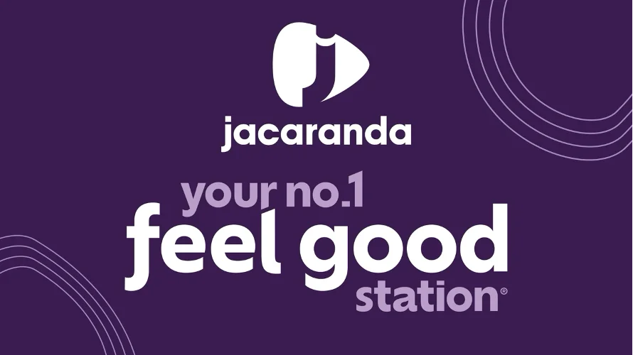
The Jacaranda FM rebrand introduces a simplified logo, an expanded purple colour palette and a new typeface as the South African radio station refreshes its visual identity around a familiar promise: making people feel good.
Announced on 2 November 2026, the refreshed identity marks a new chapter for Jacaranda FM as the station strengthens its presence across radio, digital content, social media, live events and brand partnerships.
Rather than moving away from its established personality, the broadcaster is using the redesign to express its Feel Good positioning in a more contemporary and recognisable way.
Jacaranda FM Rebrand Introduces a Fresh Visual Identity
The Jacaranda FM rebrand builds on the station’s existing visual identity while introducing several design changes.
Purple remains the brand’s defining colour, but the updated identity incorporates additional shades to create greater visual depth and flexibility.
The station has also introduced a simplified logo designed to reflect its refreshed direction.
A new brand typeface adds another layer of personality, with smile-inspired details incorporated into almost every letter.
Together, these elements create a visual system intended to communicate the warmth, familiarity and positive energy associated with Jacaranda FM.
The redesign represents an evolution of the station’s established identity rather than a complete change in its positioning.
Why Jacaranda FM Is Putting Everyday Joy at the Centre
The refreshed identity draws inspiration from findings in Time Out South Africa’s The Joy Revolution research.
According to the findings cited by Jacaranda FM:
- 81% of respondents said spending time with people they like gives them energy.
- 81% said they feel happiest when spending time with loved ones.
- 74% said resting brings them satisfaction.
These insights highlight the importance of everyday experiences in creating happiness.
For Jacaranda FM, the findings reinforce the idea that joy does not always come from major celebrations or extraordinary experiences.
It can also come from familiar routines, music, shared laughter, meaningful relationships and moments of relaxation.
The station is using this understanding to strengthen the connection between its visual identity and its established Feel Good philosophy.
Jacaranda FM Managing Director Explains the Refresh
Vuyani Dombo, Managing Director of Jacaranda FM, says the brand refresh is rooted in understanding what happiness means to listeners.
“Being a feel-good brand has always been central to who we are,” Dombo explains.
He says the research reinforced the importance of simple moments that bring happiness and connection into people’s lives.
The refreshed identity is intended to make that philosophy more visible across the station’s different audience touchpoints.
Rather than presenting the new look as a departure from its heritage, Jacaranda FM is positioning it as a more expressive version of the personality listeners already know.
Jacaranda FM Rebrand Reflects Growth Beyond Radio
Another important aspect of the Jacaranda FM rebrand is the station’s expanding presence beyond traditional broadcasting.
Although radio remains central to its offering, the brand now connects with audiences through several channels.
These include digital content, social media, live experiences and commercial partnerships.
As audiences increasingly interact with media brands across multiple platforms, a consistent and adaptable visual identity becomes more important.
Jacaranda FM’s refreshed logo, colours and typography provide a foundation for presenting the brand across different formats while maintaining a recognisable personality.
Dombo says the station wants listeners to experience the same Jacaranda feeling whether they are engaging through radio, online content or community events.
What the New Jacaranda FM Identity Means for Branding
From a brand strategy perspective, the refresh demonstrates how an established media brand can modernise its appearance without abandoning its core identity.
Jacaranda FM has retained purple as its signature colour, preserving an important element of brand recognition.
At the same time, the simplified logo and expressive typography introduce a more contemporary design language.
The research-led approach is also notable.
Instead of treating the redesign purely as a visual exercise, the station has connected its creative decisions to audience insights about happiness, relationships and everyday experiences.
This gives the identity a clearer strategic foundation.
For brands operating across multiple channels, the Jacaranda FM refresh offers an example of how visual consistency and emotional positioning can work together.
A New Chapter for Jacaranda FM
The Jacaranda FM rebrand represents a fresh expression of the station’s longstanding Feel Good philosophy.
Through updated colours, a simplified logo and a distinctive new typeface, the broadcaster is reinforcing its commitment to creating positive experiences for audiences.
As Jacaranda FM continues to connect with listeners through broadcasting, digital platforms and live experiences, its refreshed identity is designed to bring a consistent sense of personality to every interaction.
The result is a brand evolution built around a simple idea: everyday moments of connection can be just as meaningful as the big occasions.
Jacaranda FM’s refreshed identity highlights how established South African brands can modernise their visual language while staying true to their core personality. Explore more brand identity and rebranding stories on Pat on Brands to discover how brands are evolving. For further details on Jacaranda FM’s new logo, expanded purple palette and typography, read the original report published by Lifestyle and Tech on 2 November 2026.